Waste Delivery
SaaS, Dashboard

Samuel Okpere
Oct 2024
What's it about?
Think of it as building a calm control room for a messy, noisy business—waste logistics. I designed a dashboard for a company that runs thousands of IoT-enabled bins and a fleet of trucks.
My aim was simple:
Stop the chaos and make it obvious what to do next. Big numbers up top, a map in the middle for spatial sense, and actionable lists for the nitty-gritty.
Dark theme? Intentional, less glare on tablets during night shifts, and a more focused vibe for operators.
What’s the problem with the current waste industry?
The current waste ops are brutal for UX because. Companies need to track thousands of distributed sensors, prioritize pickups, and manage a rotating fleet and still keep routes efficient and downtime minimal.
What I’m saying is:
There’s tons of data: thousands of sensors, dozens of trucks, constant state changes.
People need to make fast decisions without choking on raw telemetry.
Sensor readings are messy: sometimes “TBD,” sometimes stale. The UI has to show uncertainty without confusing users.
So the challenge wasn’t “show everything.” It was “show what matters, quickly.”
What are other products doing?
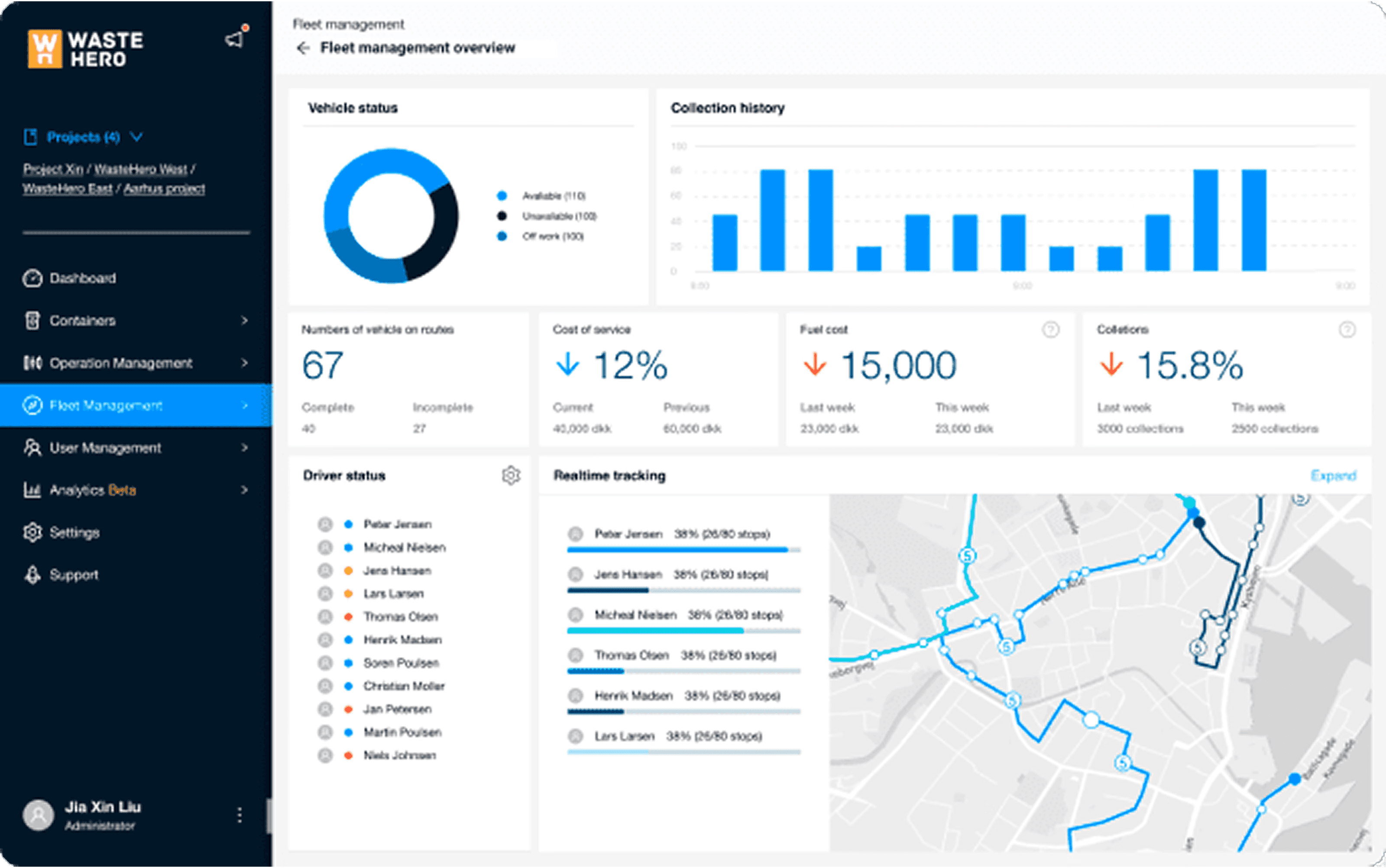
I did a quick audit across municipal waste platforms.
Quick takeaways: lots of raw data, poor prioritization. Good for analysts, bad for dispatchers.
Examples: WASTE HERO
Examples: Sensoneo

The Solution (What I designed)
This enterprise software was envisioned to tackle the industry pain point, step by step. I worked on three core screens, each doing a specific job.
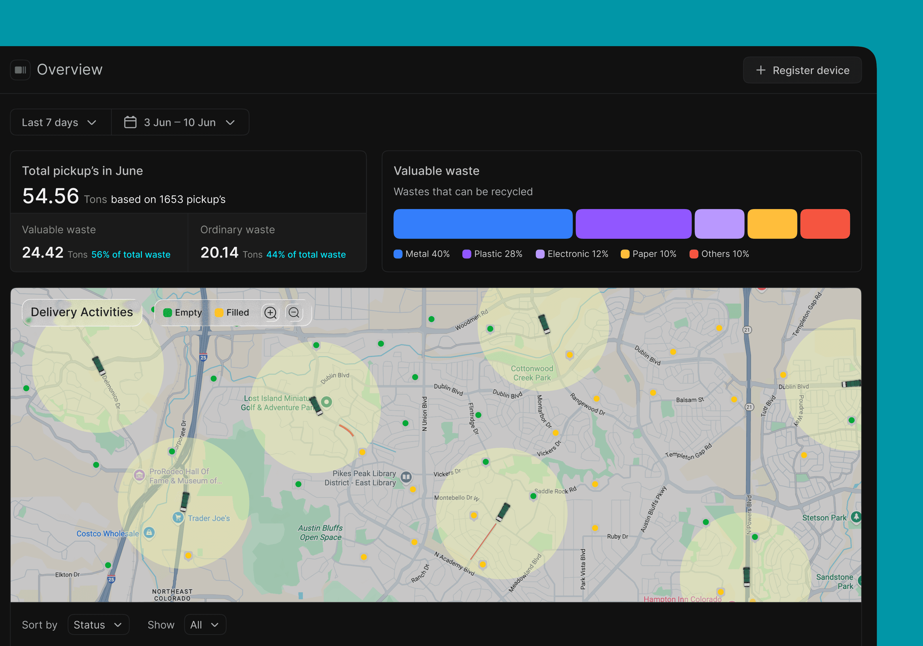
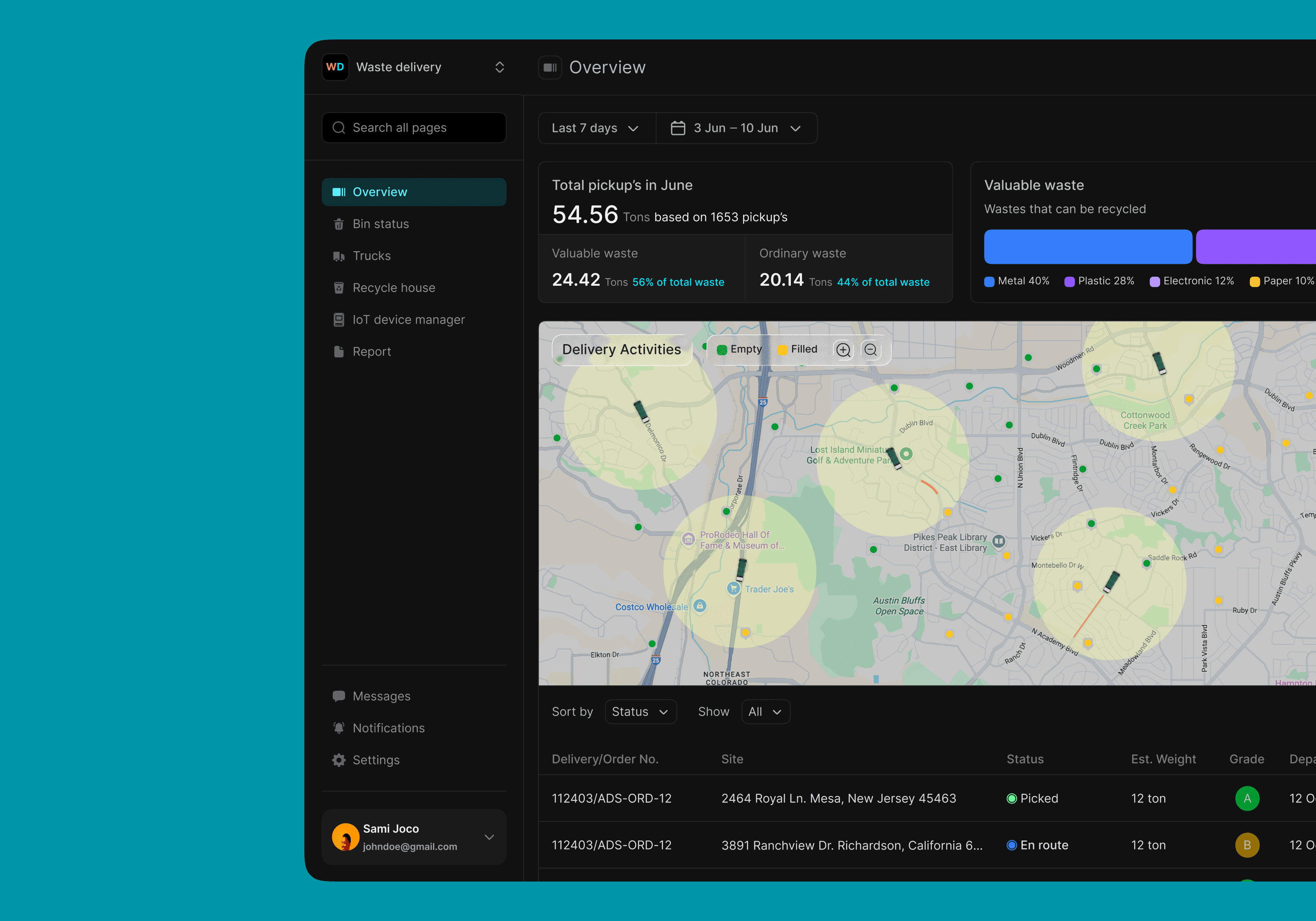
Screen 1: Overview
Executive + map: Obvious KPI cards (Registered devices, Active, Filled/Unfilled), a composition bar for valuable waste (metal, plastic, etc.), and a big map with soft-radius clusters, truck live locations and IoT enabled waste bin.

Screen 2: Bin status
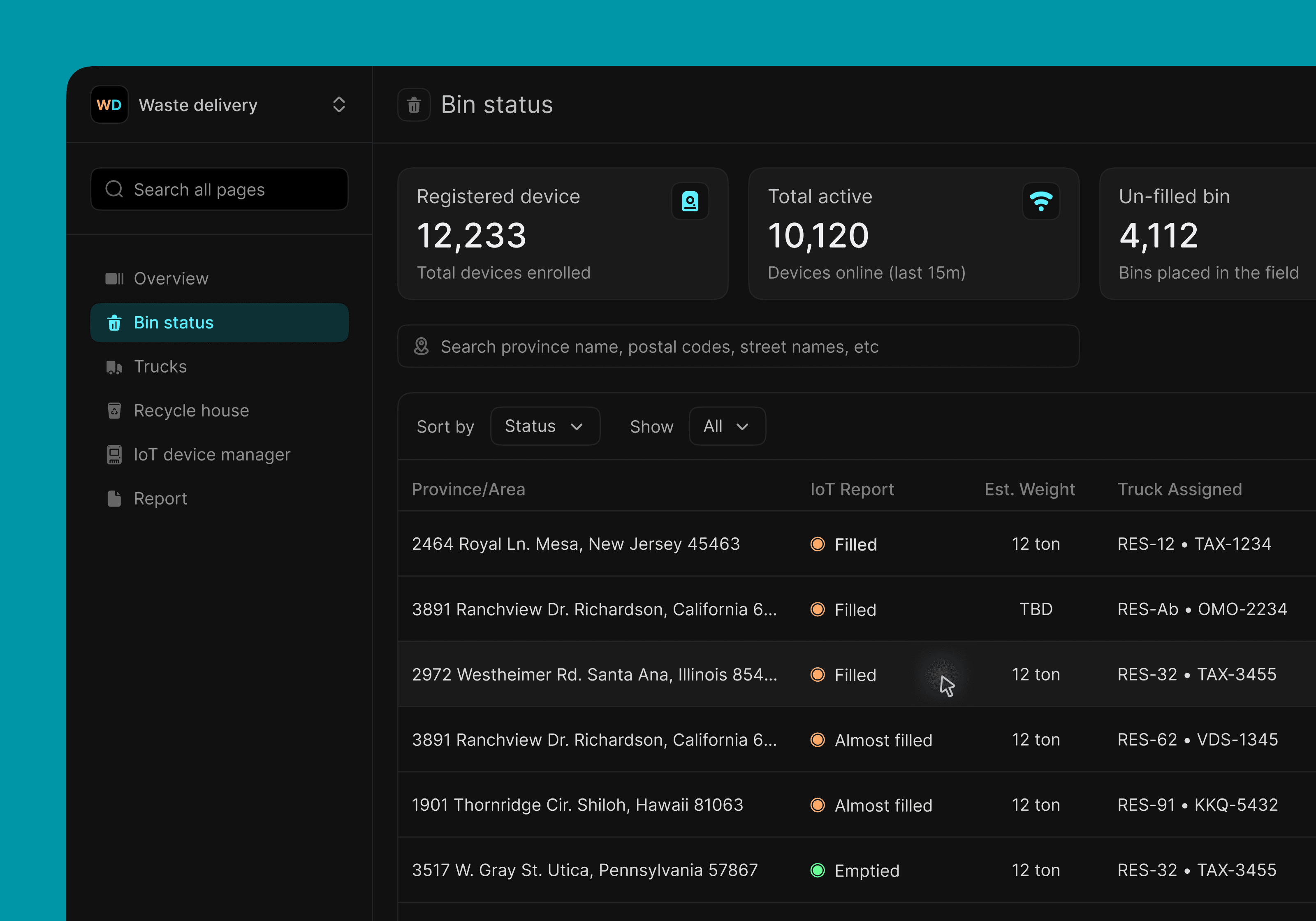
Operations list: Searchable, sortable table of bins with bin metrics (Filled, Almost filled, Emptied), estimated weight, assigned truck, and ETAs.
Rows are compact but actionable; each has a contextual menu for reassigning, flagging, or pinging a driver
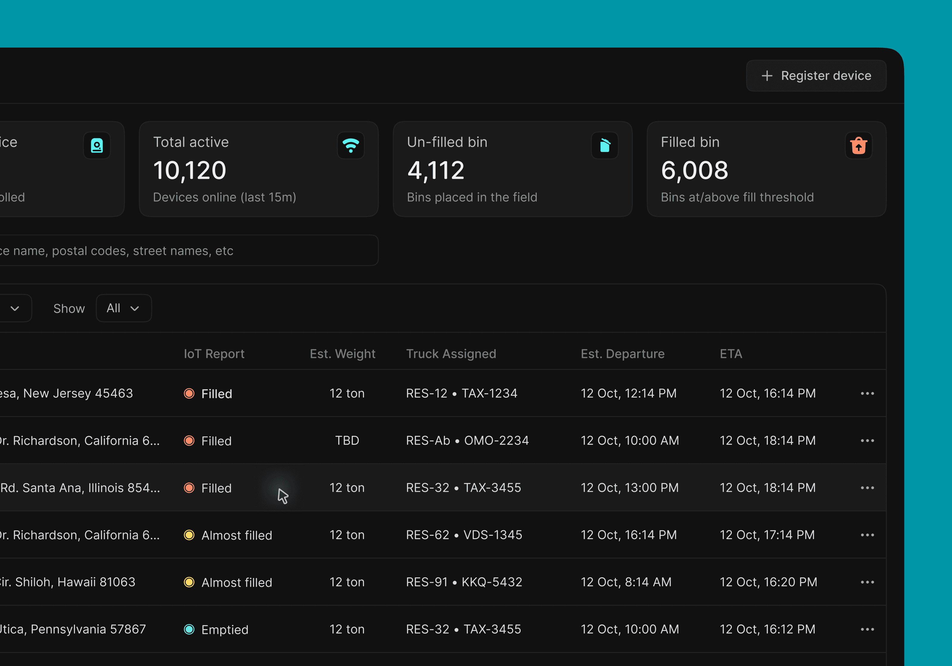
Screen 3: Trucks
Fleet cards: Photo, state badge (In field, Maintenance, Offline), last known location, capacity, and a driver selector. This bridges the machine and the human who’s driving what, where.
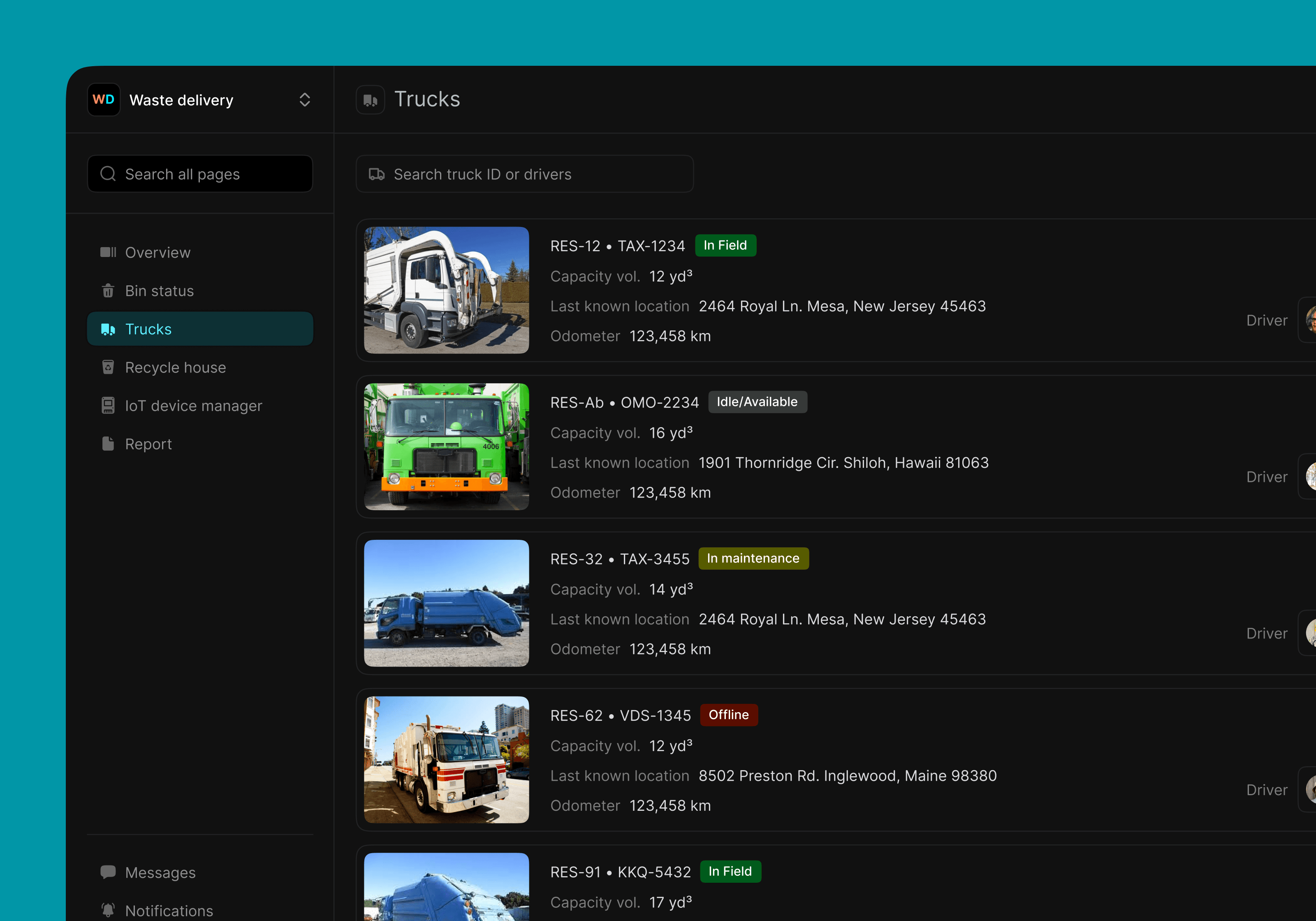

Design choices that mattered: readable KPI-first layout, color + shape for status (so colorblind users still get meaning), progressive disclosure (keep the interface clean but actions one click away), and filters for data recency (e.g., “sort by: 7 days)”).
Learnings
Prioritized lists beat raw telemetry. Operators don’t want every sensor reading — they want a ranked queue of what to do (fill level + SLA + proximity).
Maps are conversation tools. Showing soft service zones changed how teams discussed coverage and routing.
Words matter. Tiny copy differences — “Unfilled” vs “Un-filled” or “En route” vs “In field” — actually changed how pilots interpreted statuses. Standardizing labels was a small but hugely valuable fix.
Design for uncertainty. Sensors lie or lag. Surface that uncertainty (TBD badges, faded timestamps) rather than pretending everything is precise.
There’s more to do. If I had more time: automated route batching, device health drilldowns (battery, signal), and a mobile-first tablet UI for drivers (offline-ready).
