Worksync
Mobile App, SaaS

Samuel Okpere
Jul, 2023
In 2023 Worksyn began as a personal initiative to address common pain points in existing project management tools, such as cluttered interfaces and fragmented communication.
By concentrating on mobile-first design, I aimed to empower remote and on-the-go teams with a clean, efficient app.
Problem statement
How can we integrate task creation, scheduling, commenting, and individual messaging into a cohesive mobile experience that feels natural and collaborative? Teams often juggle multiple tools, one for tasks, another for scheduling, and yet another for chats, resulting in lost productivity and miscommunication.
Key challenges identified include:
Difficulty in quickly assigning and tracking tasks.
Lack of contextual discussions is tied directly to tasks.
Inefficient switching between group comments and private messages.
Research
I analyzed competitors like Trello, Asana, and Slack, noting strengths in visualization but weaknesses in unified experiences. Personas were developed: "Alex the Project Manager," who needs oversight; "Jordan the Team Member," focused on execution; and "Sam the Collaborator," emphasizing communication.
From this, user flows were mapped, highlighting entry points for task creation, viewing details, and messaging.
Design Process
Adopting a lean UX approach, I started with low-fidelity sketches to outline navigation. Core principles included:
Simplicity: Minimalist UI with ample white space.
Consistency: Uniform icons and color schemes (blue for actions, green for progress).
Accessibility: High contrast, large touch targets, and voice-over support.
Collaboration Focus: Real-time updates and easy sharing.
Wireframes evolved into high-fidelity prototypes using Figma.
Key Screens
The app's UX revolves around four primary screens, each optimized for the described features.
Screen 1: Dashboard
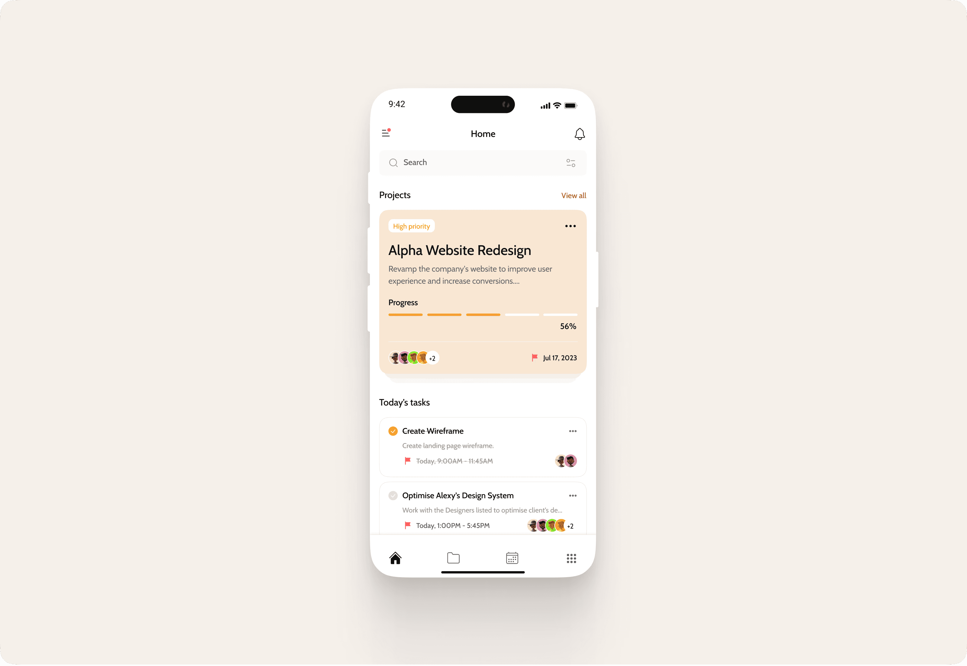
The dashboard serves as the home base, providing an at-a-glance overview of projects, pending tasks, and upcoming schedules. Users can quickly scan assigned tasks, see team activity, and navigate to creation or details.
Screen 2: Schedule or Calendar Page
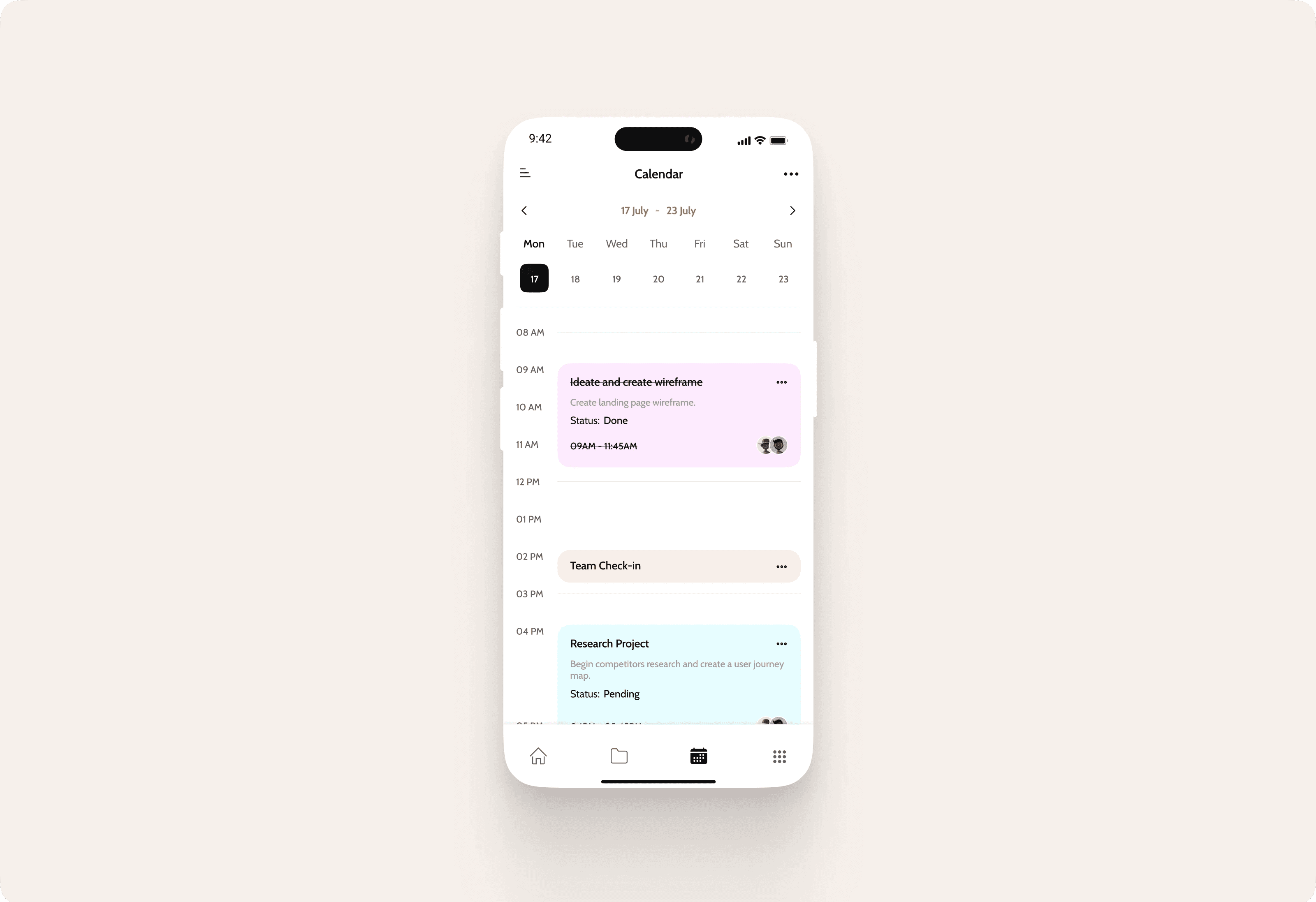
This screen focuses on scheduling, displaying a calendar view where users can add, edit, or reschedule tasks. Integration with device calendars enables syncing, and drag-and-drop functionality simplifies adjustments. Team members can see shared schedules, with color-coding for priorities and alerts for conflicts to enhance collaborative planning.
Screen 3: Progress Tracking or Project Dashboard
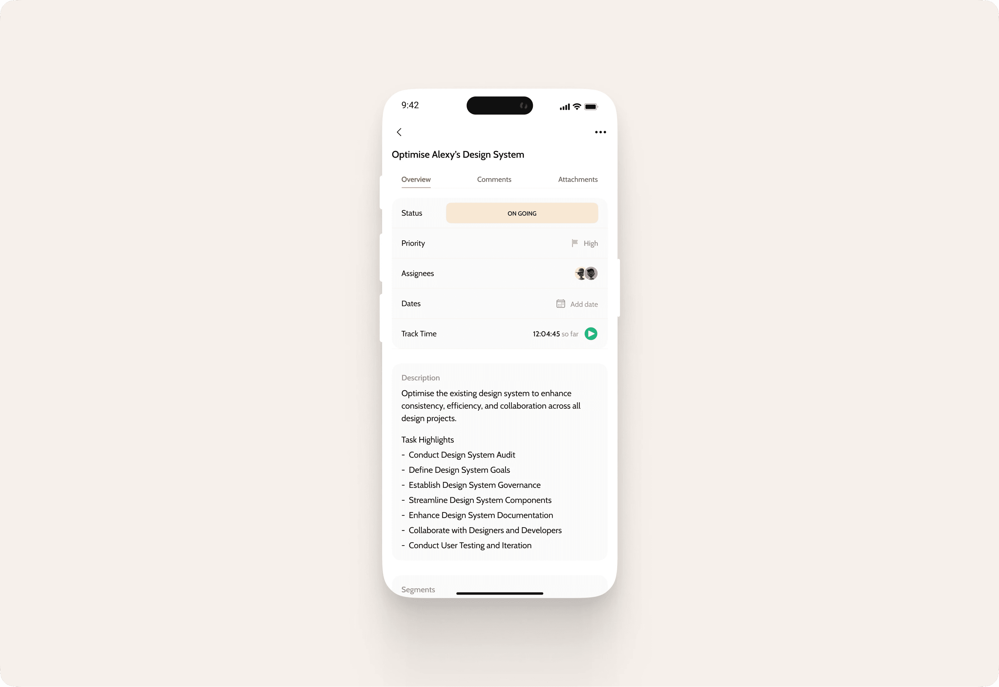
Users can comment on tasks here for contextual feedback, update statuses, and get real-time updates ensure everyone stays aligned on project health.
Screen 4: Private Messaging Page
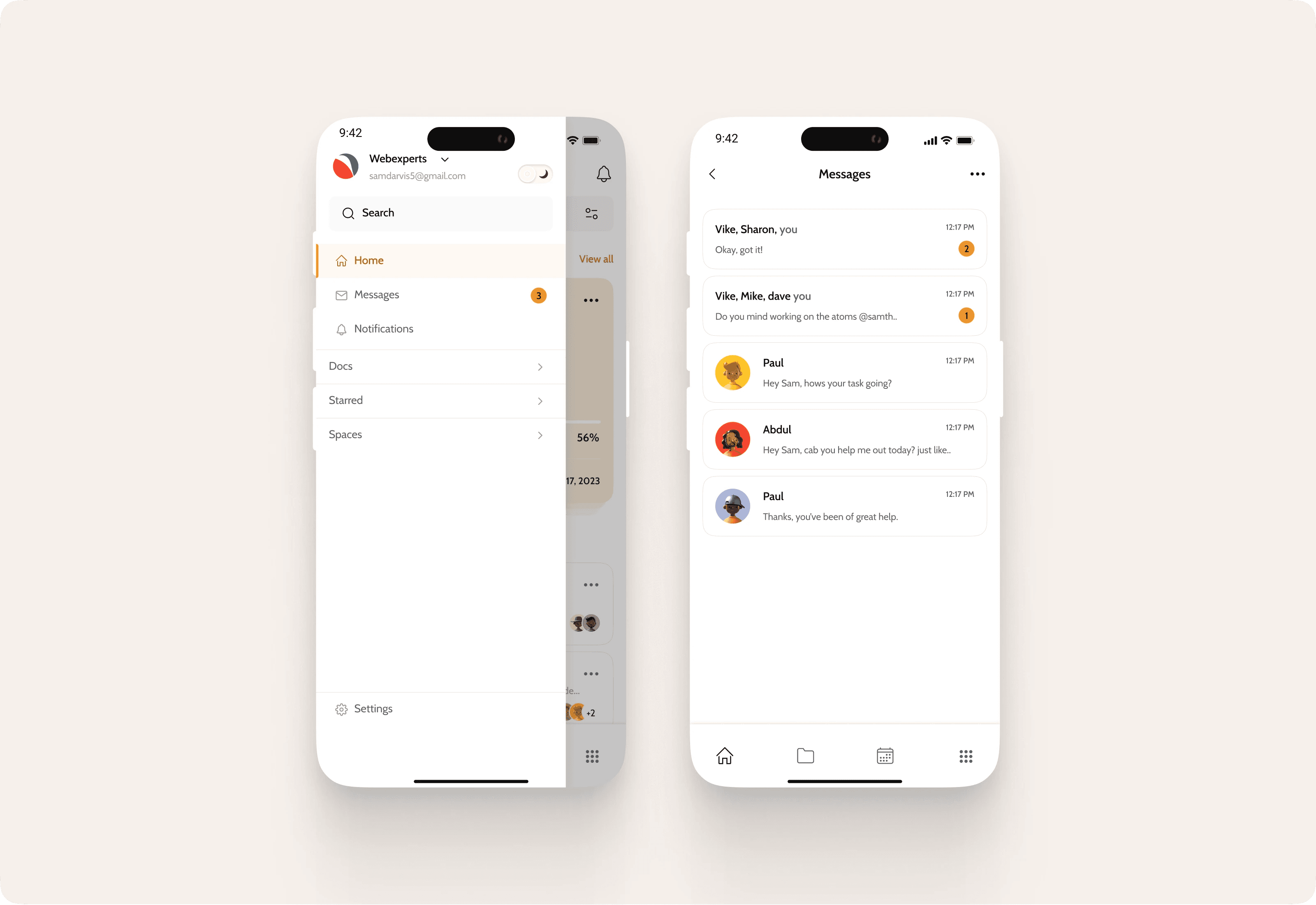
For individualized communication, this screen offers a secure messaging interface where users can send private messages to team members. Conversations can reference specific tasks or projects, with options for file sharing and quick replies.
Conclusion
This updated UX design for Worksyn demonstrates how targeted screens can elevate project management into a truly collaborative experience. By prioritizing user needs and iterative refinement, the app not only meets functional requirements but enhances team dynamics.
How it can be improved
Future expansions could include AI-assisted prioritization or advanced integrations.
