Sakani Design System for SaaS
Design system, React library

Samuel Okpere
Jul, 2026
Why I built this
Every founder I've worked with has the same problem at the start: a great idea, no funding, and a product that looks like it was built in a weekend, because it was.
Good UI is expensive. Hiring a designer costs money. Buying a UI kit costs money. Learning design takes months. So early products ship looking rough, and rough-looking products are harder to pitch, harder to sell, and harder to trust.
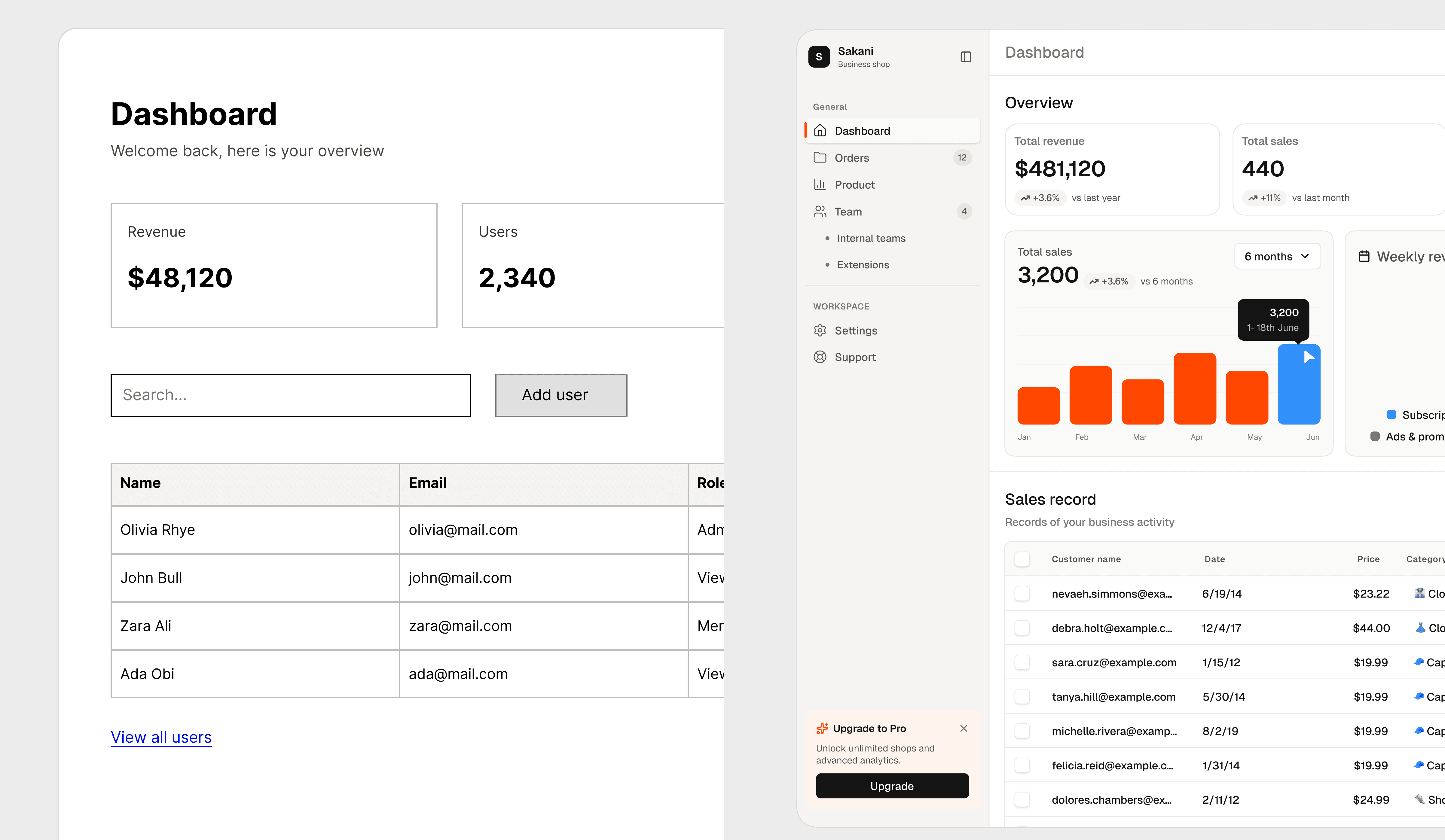
I wanted to remove that problem entirely. Sakani is a complete design system, 45+ components, light and dark mode, and a matching React code library, and it's free. MIT licensed, no strings. A founder with little to nothing can now ship a product that looks like it had a design team behind it.
What Sakani actually is
Sakani is two things that mirror each other perfectly:
A Figma file with every component: buttons, forms, tables, charts, a calendar, a full sidebar navigation kit each with all its sizes, states, and variants, in both light and dark mode.
A React code library where every one of those components exists as real, working code. Same names, same variants, same colors. If a designer uses "Button, Primary, Loading" in a mockup, a developer types <Button variant="primary" loading> and gets the identical thing.
That mirror is the whole idea. Most free UI kits are design-only (pretty pictures, no code) or code-only (works, but designers can't touch it). Sakani is both, kept in sync by a shared token system.

Step 1: Start with tokens, not components
This is the most important lesson in this whole case study, and the one most beginners skip.
Before I drew a single button, I built the token system. Think of tokens as the paint supply for the entire project. Instead of picking "some blue" every time you need a color, you mix all your paints once, give each one a name, and only ever paint with named colors.
Sakani's tokens live in three layers:
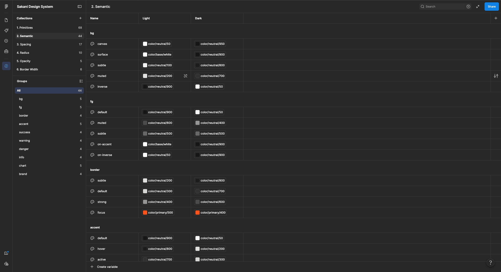
Primitives are the raw ingredients, a scale of grays from near-white to near-black, a scale of oranges, greens, reds. They have boring names like neutral-100 and no opinions about where they get used.
Semantic tokens are the layer with meaning. Instead of "gray-200," you get names that describe a job: background/surface, text/muted, border/subtle, accent/default. Each semantic token points at a primitive.
Components only ever use semantic tokens. A button's background is accent/default, never a raw hex code.
Change one semantic token, and every component that uses it updates everywhere, in the design file and the code, at the same time. It's also what makes dark mode almost free, more on that in a moment.
Step 2: Design the components in Figma
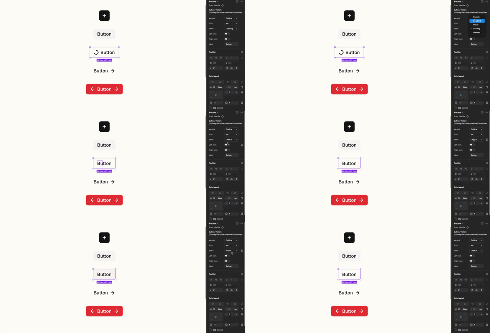
With tokens ready, I designed the components, smallest first. Badges, labels, spinners, and dividers before inputs and dropdowns. Inputs and dropdowns before tables and sidebars. Every big component is built out of small ones, so the small ones have to be right first.
For each component I designed every variant (the versions you choose between, like Primary vs. Outline) and every state (what it looks like when hovered, pressed, focused, disabled, loading). This is the unglamorous part that separates a real design system from a collection of pretty rectangles. A button isn't done when it looks good, it's done when you know what it looks like in all fifteen situations it can be in.
By the end, the file held 45+ components covering everything a SaaS product needs: forms, navigation, data tables, charts, feedback messages, a date picker, and a nine-part sidebar kit.
Step 3: Light and dark mode from one switch
Because every component only uses semantic tokens, dark mode wasn't a redesign, it was a second column of values. background/surface means near-white in light mode and near-black in dark mode.
The components themselves never change; only the meaning of their tokens does.
In Figma this works through variable modes: select any frame, flip it from Light to Dark, and everything inside re-themes instantly. In code it's one CSS class. That's the entire dark mode implementation.

Step 4: Turning designs into real code
Here's where I'll be honest about my limits, I'm a designer, not a developer. I can't write React from scratch.
What made the code library possible was using AI to convert my Figma components into React code and refine the details. The designs, the token architecture, the variants, and every visual decision were mine, the AI's job was translation, reading the exact values from my Figma file (spacing, colors, states, sizes) and producing code that matched them.
My job in this phase was quality control, and it mattered more than I expected. I reviewed every component in Storybook, a tool that displays each coded component with all its variants, like a living catalog, side by side with my Figma file, and caught plenty of mismatches, a wrong active-state indicator on the sidebar, a checkbox using hard borders where my design used soft shadows, fonts not loading, spacing that drifted. Each round of review made the code more faithful to the design.
The lesson for non-coders: you don't need to write code to ship code, but you absolutely need to be able to judge it. Your eye for detail is the skill that makes the tools useful.

Step 5: Making it accessible
A design system used by many products has a responsibility: if it's inaccessible, every product built on it is too.
So the system went through an accessibility pass with real measurements, not vibes. Every text color was tested against its background for contrast (there are free checkers for this, the standard to hit is called WCAG AA). Placeholder text that measured too faint got darkened. Every interactive element got a visible focus ring so keyboard users can see where they are.
None of this is visible in a screenshot, which is exactly why it gets skipped in most free kits — and exactly why I'm proud it's in this one.

Step 6: Publishing everything
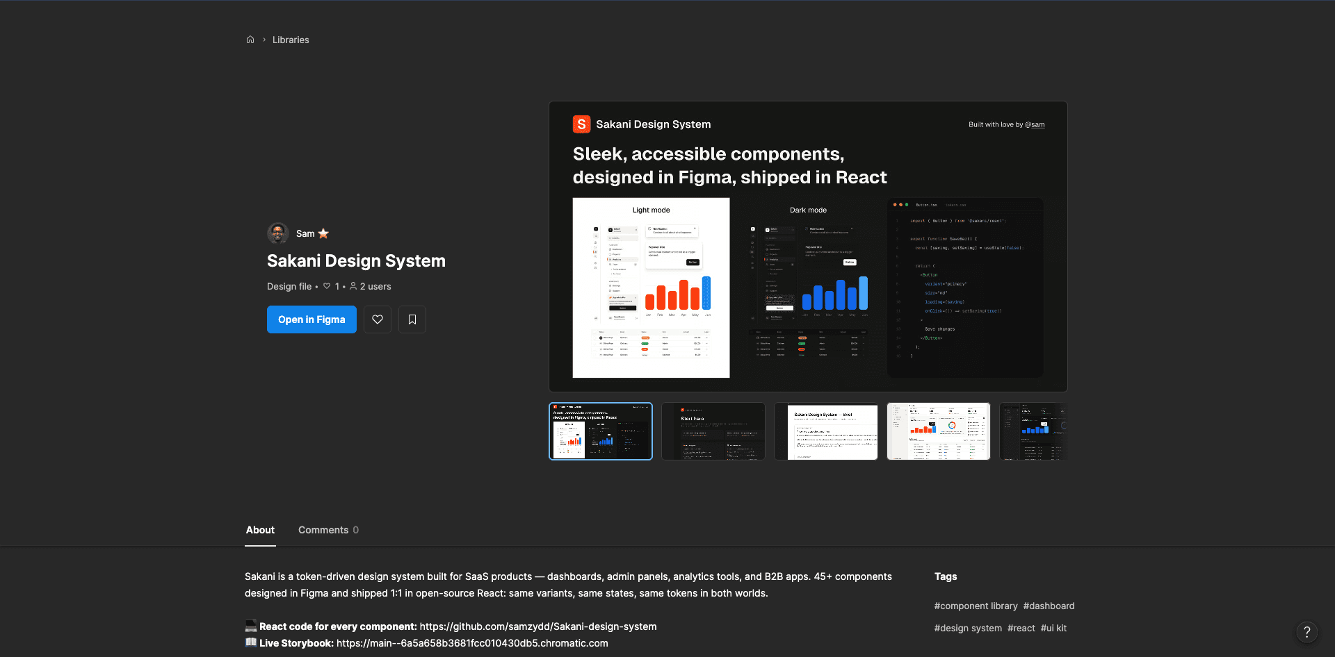
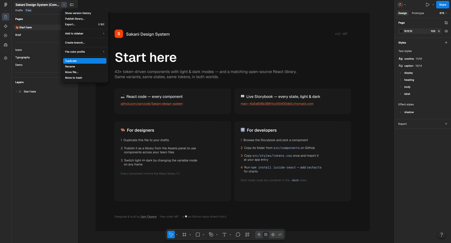
Shipping meant three public destinations. The code went to GitHub as an open repository, where anyone can read or copy every component. The component catalog went to Storybook, published at a permanent link, so anyone can play with every component and state in their browser without installing anything. And the design file went to Figma Community, where any designer can duplicate the entire system into their own workspace in one click.
How to use Sakani (the two-minute version)
If you're a designer or founder mocking up your idea: duplicate the Figma file, publish it as a library in your workspace, and start assembling screens from the components. Flip any frame to dark mode with one setting.
If you're building the product: browse the Storybook, pick a component, copy its folder from GitHub into your project, copy the tokens file once, and use it. The code is plain React with TypeScript, no exotic dependencies, and you own every line you copy.
Where to find it
Sakani is free for personal and commercial use, MIT licensed.
Figma Community: figma.com/community/file/1661001585975776295 Code + live Storybook: github.com/samzydd/Sakani-design-system
If it saves you time, and if you're a founder without funding, I hope it saves you a lot of it, a like on Figma or a star on GitHub helps other people find it.